Mapping energy burden in Minnesota
Published September 14, 2022
Guest post by Christine McCormick
In spring 2022, I began my internship with CUB. My project was to map energy burden and contributing factors in Minnesota and to publish it in the form of an ArcGIS StoryMap. In my last semester of undergrad, I was ready to step up to the challenge and put the skills I had spent the last three and a half years of my college career building to use.
Before I could begin mapping, I had to learn about what exactly energy poverty is and what contributed to it. In the United States, 31% of households struggle to pay their energy bill or to keep their household properly warmed or cooled. While the US recognizes energy poverty, there is no specific consensus on what metrics define energy poverty. The most common metric for measuring energy poverty is creating a ratio of average energy expenditures (heating, electricity, gas) to average household income. This ratio is commonly referred to as “energy burden.” Higher energy burdens have serious implications when it comes to the health and wellbeing of families experiencing it. Many have to choose between heating and air conditioning their homes or paying for necessities such as food or health expenses.
After reading some broader journal articles, I narrowed the scope of my research to energy poverty in Minnesota. I learned that in Minnesota households that spend 6% or more of their income towards energy expenditures to electrify, heat, and cool their homes are considered to be energy burdened by the Minnesota Department of Commerce.
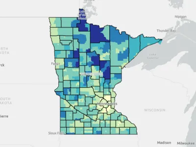
My maps indicate specific areas of Minnesota where additional attention to energy burden is particularly needed. They can help CUB understand how to prioritize efforts and make other programming decisions.
In order to create the maps, I used both ArcGIS Pro and ArcGIS Online. The majority of the data was collected from the American Community Survey in 2018 and 2020. The scope for my map was census tracts, as it’s the smallest way to display data without losing data because of privacy.
My project concluded that income tended to correlate with energy burden. (However, there were notable exceptions in southern Minnesota.) It also examined other facets of energy poverty such as building age, demographics, and percent rental vs owner. I believe that rental vs owner could be an important facet for organizations like CUB to look into. As many renters live in old, or efficient housing that may or may not be poorly maintained. Additionally, demographics also appeared to have a strong correlation with energy burden. However, housing age did not seem to have a strong correlation and I would not recommend outreach based solely on this factor.
View the StoryMap here.